Executive Summary
- The Bitcoin supply is quite tight with several measures of supply such as Illiquid, HODLed, and Long-Term Holder Supply at historical highs.
- The spending behavior of Short-Term Holders suggests a shift in market character has taken place now that the market has rallied above the key $30k level.
- Analysis of investor cost basis for various cohorts suggests that this $30k level is an important zone of interest for the bulls, with an ‘air-gap’ between there and $33k.
The Bitcoin halving is estimated to be ~166-days away, and a spot ETF approval in the US is starting to look increasingly likely. As a result, BTC investor excitement and sentiment is on the ascent. Within this context, a key question for investors is how much of the Bitcoin supply is freely circulating, as opposed to held tightly in investor wallets.
In this edition, we will explore this question, focusing on the distribution of the Bitcoin supply from a macro lens. We will use a variety of on-chain heuristics and metrics to gauge the tightness of the BTC supply.
Coins Are Getting Older
Price performance of digital assets has been impressive YTD, which as we covered last week (WoC 44). Despite this, long-term Bitcoin investors remain tight gripped, with the relative proportion of circulating supply held for longer than 1yr+ hovering at all-time-highs for several age bands.
- 🔴 Supply Last Active 1+ Yrs Ago: 68.8%
- 🟡 Supply Last Active 2+ Yrs Ago: 57.1%
- 🟢 Supply Last Active 3+ Yrs Ago: 41.1%
- 🔵 Supply Last Active 5+ Yrs Ago: 29.6%

The Illiquid Supply metric, which measures the amount of supply held in wallets with minimal history of spending is also at an ATH of 15.4M BTC. Changes in Illiquid Supply often move in tandem with exchange withdrawals, suggesting investors continue to withdraw their coins into custody, with over 1.7M BTC doing so since May 2021.

This is reflected in the monthly rate of change for Illiquid Supply which is within a multi-year period of net increase, currently increasing at a rate of +71k BTC per month.

We see a similar pattern within the HODLer Net Position Change metric (also known as Vaulted Supply within the Cointime Economics framework). Vaulted Supply has experienced a sustained regime of inflows since June 2021, however with a notable uptick following the June 2022 sell-off when 3AC and LUNA-UST collapsed.
This metric speaks to an aggregate maturation of the BTC supply, as investors accumulate and hold onto their coins, refraining from spending and transacting at an increasing rate.

A Divergence of Conviction
A powerful divergence continues to form between Long-Term Holder (LTH) supply 🔵, which is just shy of an all-time-high, and Short-Term Holder (STH) supply 🔴 which is at effectively all-time-lows. This insightful dynamic demonstrates a growing tightness within the BTC supply, as existing holders become increasingly unwilling to part with their holdings.
As we covered in our prior report, LTHs historically wait for the market to break to new price ATH before ramping up their distribution. This process can be seen by the large scale decline in their supply during the 2021 bull run, which is matched by an uptick in STH Supply, as well as Exchange inflow volumes.

If we take a ratio between Long and Short-Term Holder supply, we can see that it has broken out to new highs since July 2023. This clearly shows the magnitude of the divergence between dormant and mobile supply, and highlights an impressive tightness.

The Activity-to-Vaulting Ratio (A2VR) is a new metric which elegantly describes this divergence at a macro scale. It compares the all-time balance of coin ‘activity’ and ‘inactivity’ measured through units of investor holding time (usually coin-days or coin-blocks).
- Uptrends indicate that investors with old coins are spending, with steeper ascents indicating aggressive distribution.
- Downtrends indicate that investors prefer to hold their coins in an inactive state, with steeper trends suggesting an acceleration of this behavior.
The A2VR metric has been within a downtrend since June 2021, with the gradient steepening meaningfully after June 2022. This metric has now reached similar lows to that in early 2019 and late 2020, both preceding significant market uptrends. This also suggests that the ‘exuberance’ of the 2021-22 cycle has been completely flushed from the market.

Another lens to assess investor activity is via analysis of their spending behaviors. The Sell-Side Risk Ratio is a great tool to evaluate the absolute value of profit or loss locked in by investors in relation to the size of the asset (measured as the Realized Cap). We consider this metric under the following framework:
- High values indicate that investors in aggregate are spending coins at a large profit or loss relative to their cost basis.
- Low values indicate that the majority of coins being spent are close to break even, suggesting an exhaustion of ‘profit and loss’ at the current price range.
In this instance, we consider only the Short-Term Holder cohort as they are one of the primary drivers of day-to-day price action. Following the recent rally to $35k, the Sell-Side Risk Ratio spiked from historical lows, suggesting a ‘re-awakening’ of many young coins. This speaks to a near-term profit taking event by this cohort.
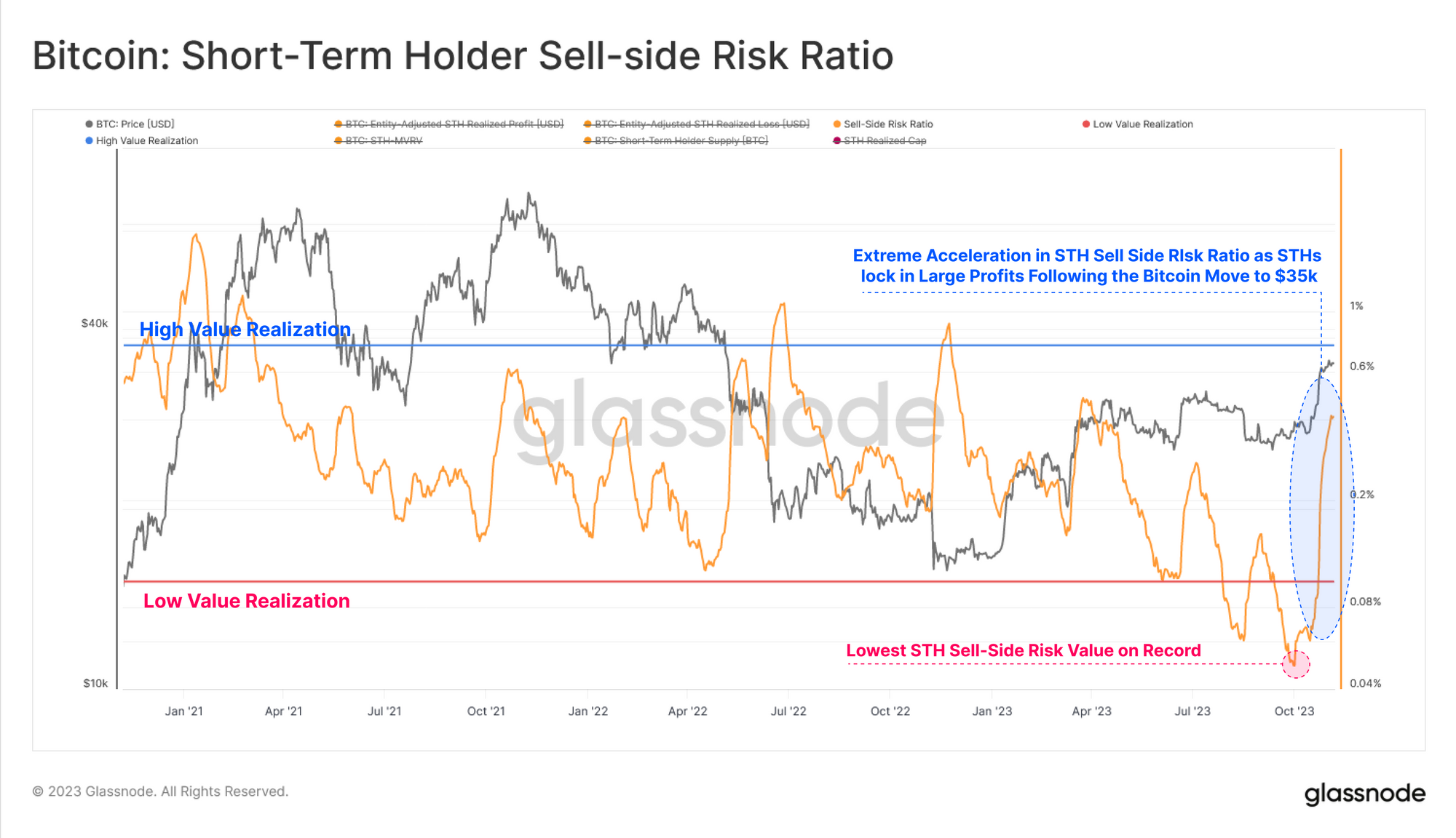
For the Long-Term Holder cohort however, their Sell-Side Risk ratio has increased slightly, yet remains extremely low in a historical context. This metric currently has a similar structure to the 2016 and late 2020 eras, which were similar periods of tight overall BTC supply.

Accumulation Across The Board
The prior set of metrics largely consider the Bitcoin supply in terms of the aggregate ageing and maturing of coins. Another lens is to consider the supply from the context of wallet sizes. The Accumulation Trend Score metric helps track supply based on entity size, and an unusual dynamic has emerged since late October.
Here we can see a near perfect inflow score 🟦across all cohorts, certainly the most stark example YTD. We can see a pattern where the market has met resistance during periods of increased net outflows 🟥 across the majority of cohorts, whilst market upticks are met with a general trend of balanced inflows 🟦. This phenomenon appears to speak to a growing investor confidence and an inflection in participant behavior.

If we isolate only entities on the smaller end of the scale such as Shrimps (<1 BTC), Crabs (1-10 BTC) and Fish (10-100 BTC), we can see their accumulation pattern is quite significant. The combined rate of balance increase for this sub-group is currently equivalent to 92% of newly mined supply, and has remained in an elevated state since May 2022.

Cost Basis Clusters
To conclude, we can use the UTXO Realized Profit Distribution (URPD) to identify areas of densely concentrated cost basis, as well as airgap price zones where relatively few coins have transacted. We can see four areas of interest within close proximity to our current spot price.
- Section A: A large cluster of supply was accumulated between $26k and $31k through Q2 and Q3 of 2023.
- Section B: An airgap is be noted between $31k and $33k, with price having passed through here quickly.
- Section C: A significance amount of supply has recently transacted within the current price range between $33k and $35k.
- Section D: Approximately 620k BTC from the 2021-22 cycle have a cost basis just above between $35k and $40k.

Finally, we can add color to this URPD distribution by splitting into Long-Term 🔵 and Short-Term 🔴 Holders. We note that the majority of STH coins are now profitable, with the majority sporting a cost basis between $25k and $30k. The uptick in the STH Sell-Side Risk Ratio from earlier aligns with the ‘profit-taking’ event which transferred coins to new investors at the current price range.
Overall, this suggests that the $30k to $31k range is a key area of interest, being the upper level of the largest supply and cost basis cluster. Given relatively few coins transacted on the road from to $35k, this makes the market reaction in the event price returns to $30k of interest. It would also align with the True Market Mean Price we presented in WoC 44 being our best estimate of the average ‘active investor cost basis’.

Summary and Conclusions
The Bitcoin supply is historically tight with many supply metrics describing ‘coin inactivity’ reaching multi-year, and even all-time highs. This suggests that the BTC supply is extremely tightly held, which is impressive given the strong price performance YTD. With the halving expected in April, and positive momentum around a spot ETF in the US, the coming months are shaping up to be exciting ones for Bitcoin investors.
Disclaimer: This report does not provide any investment advice. All data is provided for information and educational purposes only. No investment decision shall be based on the information provided here and you are solely responsible for your own investment decisions.

- SEO Powered Content & PR Distribution. Get Amplified Today.
- PlatoData.Network Vertical Generative Ai. Empower Yourself. Access Here.
- PlatoAiStream. Web3 Intelligence. Knowledge Amplified. Access Here.
- PlatoESG. Carbon, CleanTech, Energy, Environment, Solar, Waste Management. Access Here.
- PlatoHealth. Biotech and Clinical Trials Intelligence. Access Here.
- Source: https://insights.glassnode.com/the-week-onchain-week-45-2023/