Executive Summary
- Capital rotation in digital asset markets occurs both between assets (as covered last week), but also internally as coins change hands and trade between investors.
- We develop a tool utilizing the Realized Cap HODL waves to track the rotation of capital from longer-term investors to speculators (and back again).
- We couple this with a second indicator designed from NUPL variants, with both indicators helping to map out where the market is relative to past distribution cycles.
Traditional equity and commodity markets tend to rely on Market Cap as the primary valuation tool for an asset. In digital asset markets, we have an alternative metric derived from on-chain data known as the Realized Cap (more in this report). The realized cap aggregates the acquisition cost for each unit in the supply at the time it last changed hands. This in turn offers superior signal, and a more reliable approximation of the capital invested in an asset.
In this edition, we will continue our exploration of the capital rotation theme in digital asset markets (see last weeks WoC 41). However this week, we will shift our focus internally, and review the process of how coins change hands within the Bitcoin holder-base as market cycles progress.
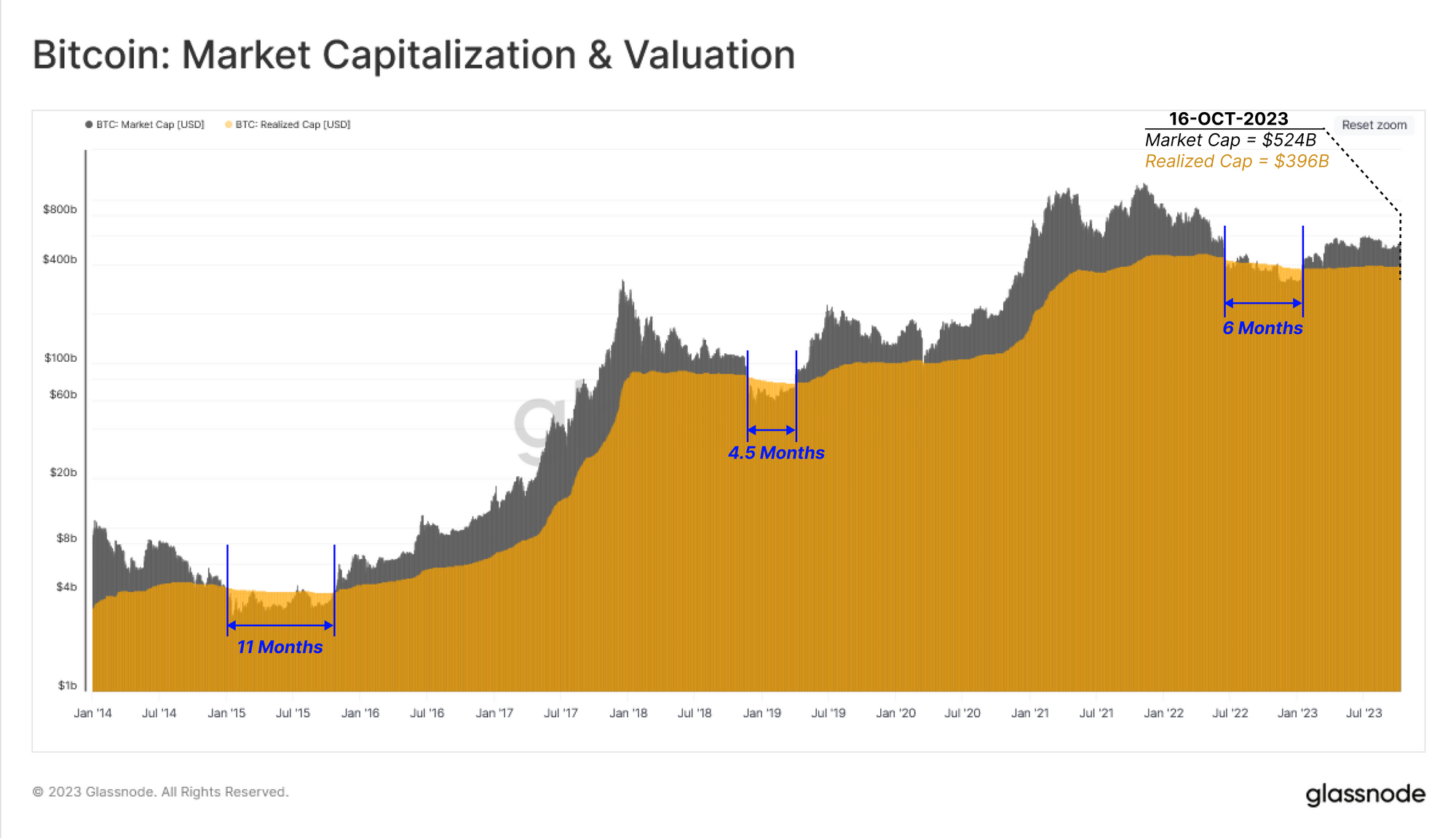
The chart below compares the market cap and realized cap for Bitcoin. Only during the deepest drawdowns of bear markets has the market cap dropped below the realized cap. Other than these extremely painful intervals, the majority of market history involves market cap trading above the realized cap, suggesting the market holds an unrealized profit in aggregate.
The market cap traded below the realized cap for a 6-month period in the second half of 2022, and has since recovered to a value of $524B, compared to a realized cap of $396B.
The realized cap tends to plateau, or drawdown slightly during bear markets, as coins change hands and are revalued to lower acquisition prices. During this process, they gradually migrate towards longer-term investor wallets where they start to mature (remaining dormant for longer periods of time).
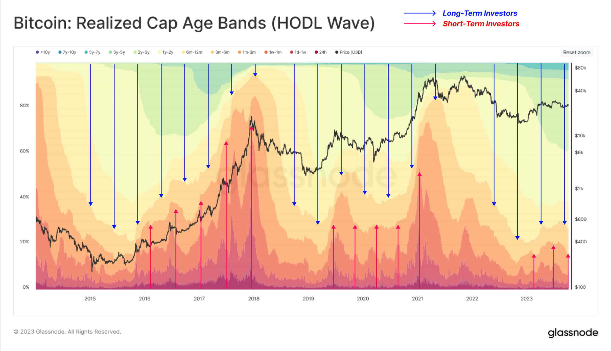
This trend can be illustrated via the Realized HODL Waves, showing shifts in wealth distribution by age cohort (as a percent of realized cap). This tool visualizes the shifting supply and demand forces in the market, as capital rotates between investors.
- 🔵 During market uptrends older coins are spent and transferred from long-term holders to newer investors (warmer bands expand, cooler bands contract).
- 🔴 During market downtrends speculators lose interest and gradually transfer coins to longer-term holders (cooler bands expand, warmer bands contract).
Currently, the market has reached an equilibrium between these two investor groups, with a slightly positive inflow of newer investors entering the market (demand side). This resembles the conditions seen in both 2016 and 2019, where the market was attempting to recover from a significant bear market drawdown.
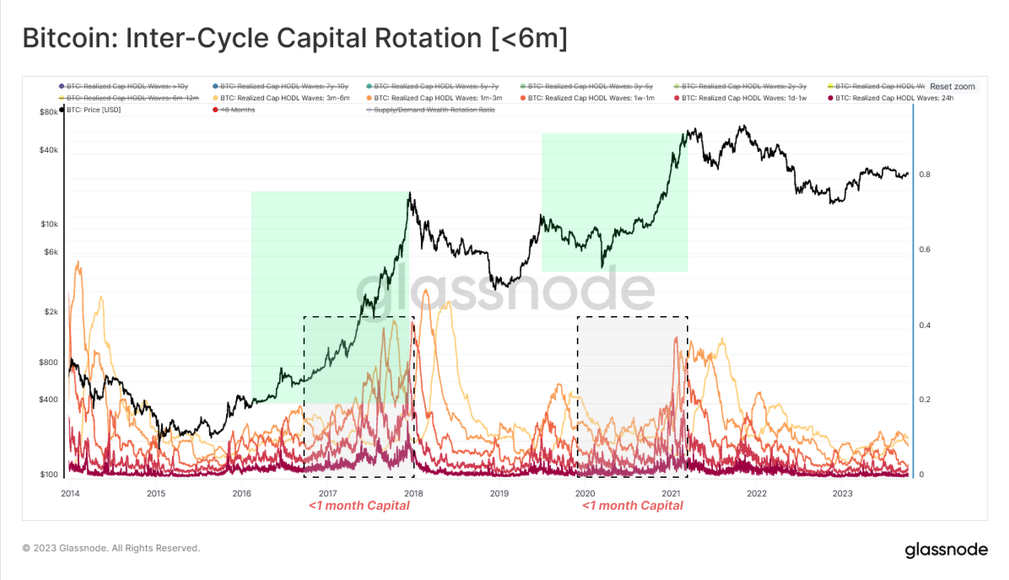
We can also isolate individual age bands to identify groups that best correspond with capital rotation between short and long-term investors.
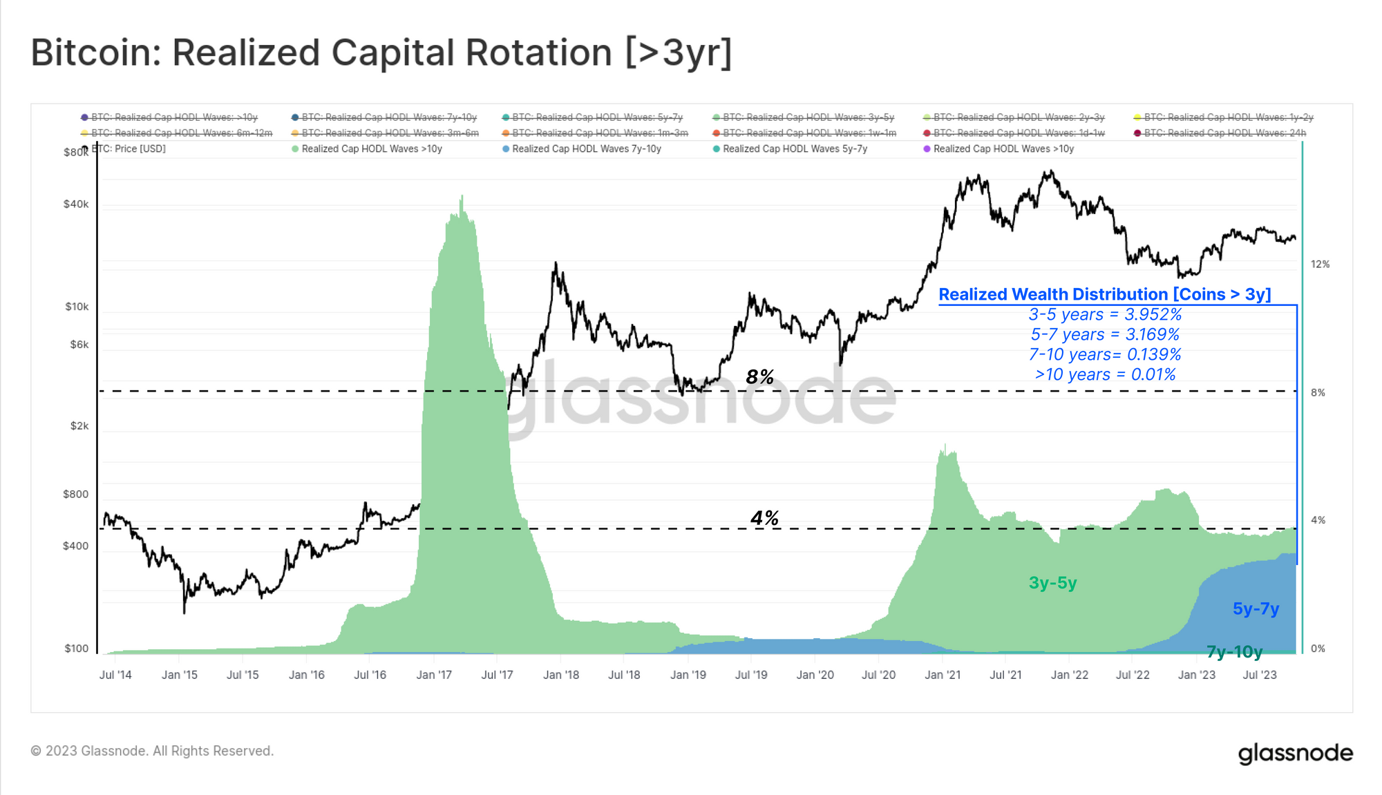
First will look at age bands which are generally insensitive to market cycles, which are typically coins dormant for at least 3-years. This can be justified by noting this cohort hold a relatively small (<5%) share of the total wealth held in Bitcoin. Most coins in this group fall into the 3y-5y range, suggesting they were acquired during the 2018-20 period.
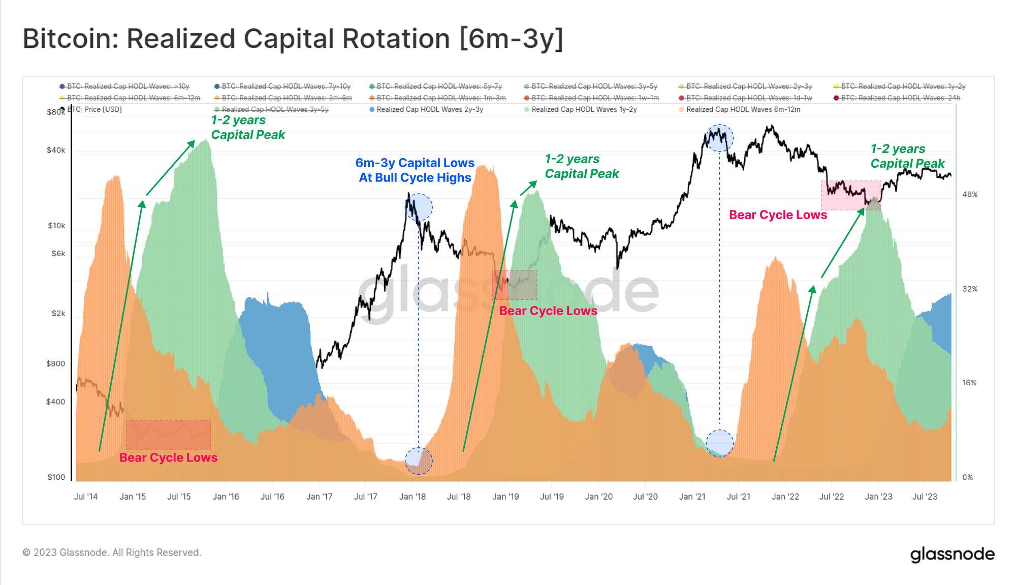
Next, we will consider the cycle-sensitive subset of longer-term investors whom were active during the 2020-23 cycle. These coins are aged 6m-3y old, and the holdings of this cohort historically reaches maximums and minimums aligned with bear market lows, and bull market highs, respectively.
The peak of capital held within in the 1-2 year age band 🟢 often aligns with the deepest points of a bear market when rates of accumulation by high conviction holders is highest, working to establish a market floor. Conversely, capital held by this cohort reaches a minimum near bull market tops, as they exert maximum distribution pressure and eventually overwhelm inflowing demand.
Lastly, we look at the youngest age band cohorts attributed to short-term investors and speculators. These bands are more closely related to the inflow of demand, being the actively traded coins that have recently changed hands. These age bands move inversely to the 6m-3y cohort, swelling during uptrends (new buyers), and compressing during bear markets as interest and activity in the asset wanes.
We note that the <1-month cohort is particularly responsive, and is a suitable opposing counterpart to the 1y-2y band to approximate the ‘middle’ behaviour of these two groups.
We can now synthesise this capital rotation process into two dominant cohorts which tend to drive the market:
- Short-Term Indicator [<1 month] 🔴 The realized capital or wealth portion moved in the last 30 days. This cohort corresponds closely to the demand side, including new investors deploying fresh capital into the market.
- Long-Term Indicator [1-2 years]🔵 This portion of the supply peaks during the bear market bottom formation phase. This cohort represents the long-term and price insensitive investors that accumulated during, and held throughout the bear market.
During bear markets, the long-term indicator swells and holds more than 15% of the BTC capital (and also trades well above the short-term indicator). This structure illustrates the dominance of accumulation/holding conviction in the market.
This dynamic ends when new capital flows into the market, providing exit liquidity for long-term holders, and pushing the short-term indicator higher (and above the long-term indicator). This pattern describes an expansion of buy side pressure as prices rally and attract attention in the bull market.
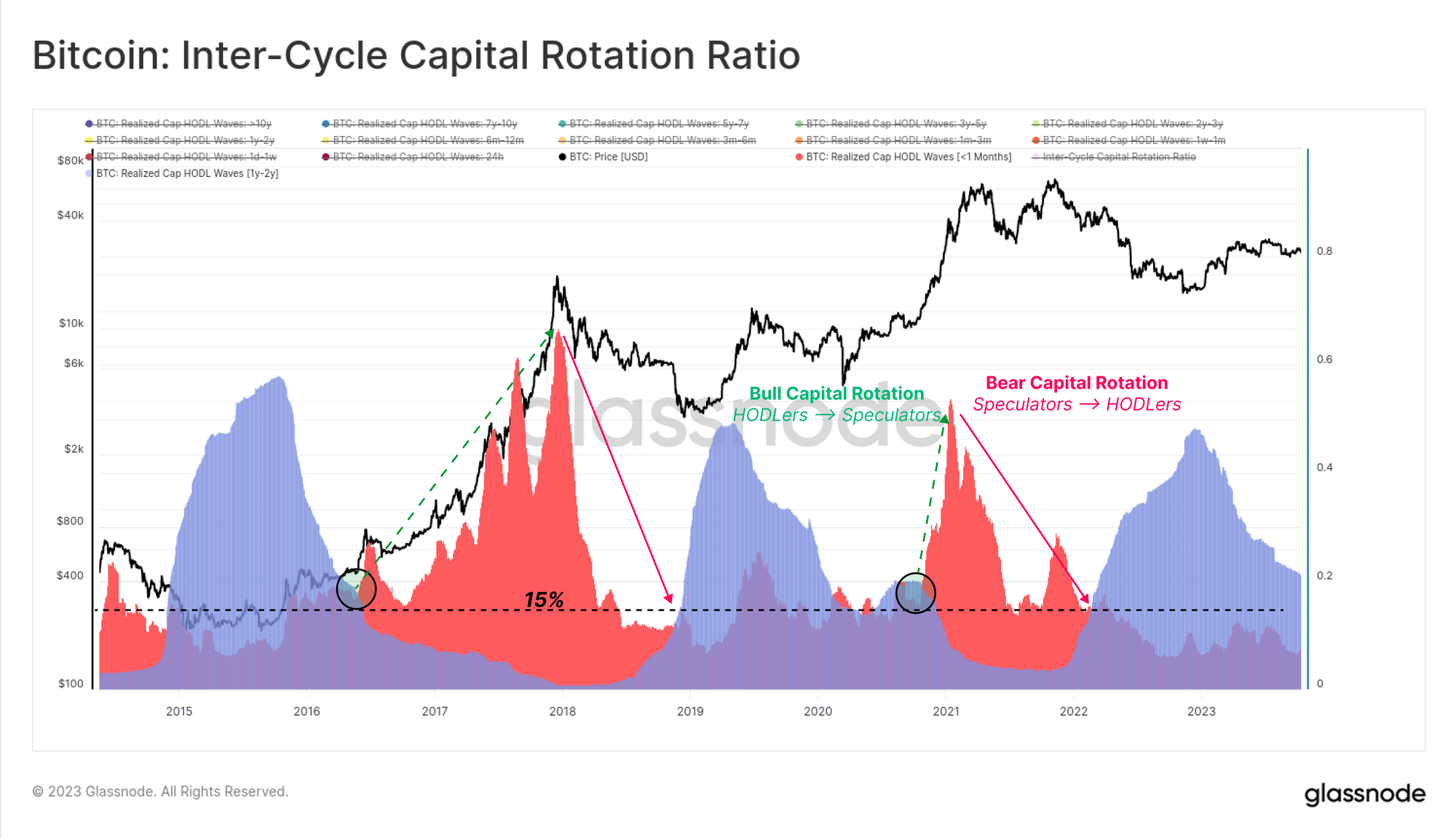
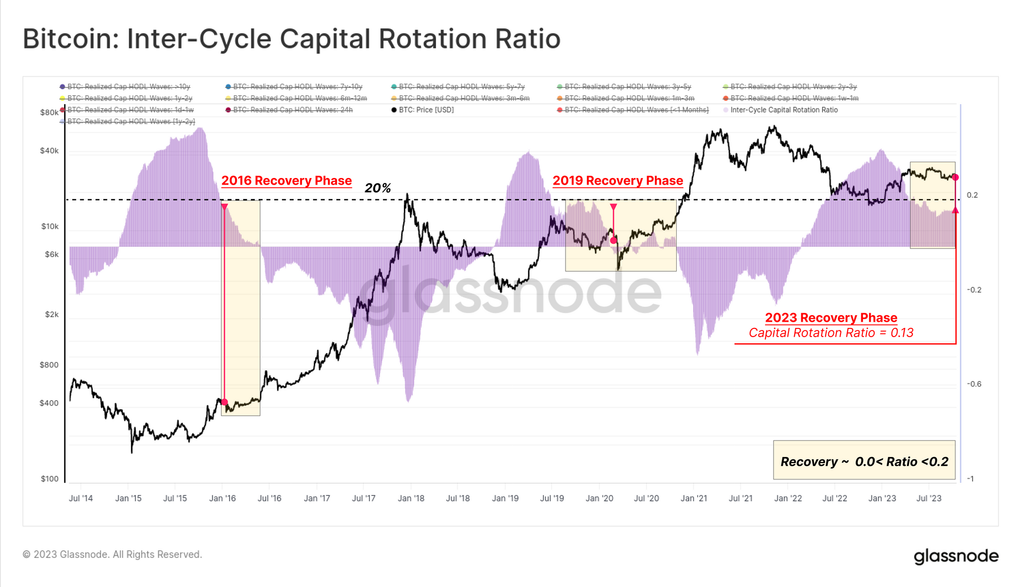
To conclude this study, we can measure the difference between these two indicators (1y-2y minus <1m) to map out the market’s current status based on the capital rotation between long-term (supply) and short-term (demand) players.
This Inter-Cycle Capital Rotation Ratio 🟪 is displayed below, and is currently trading at a level of 13%, which is similar to levels seen in 2016 and 2019. This indicates that the Bitcoin supply remains strongly dominated by the HODLer cohort, with a super-majority of coins now being older than 6-months.
Sizing Up Investor Pain
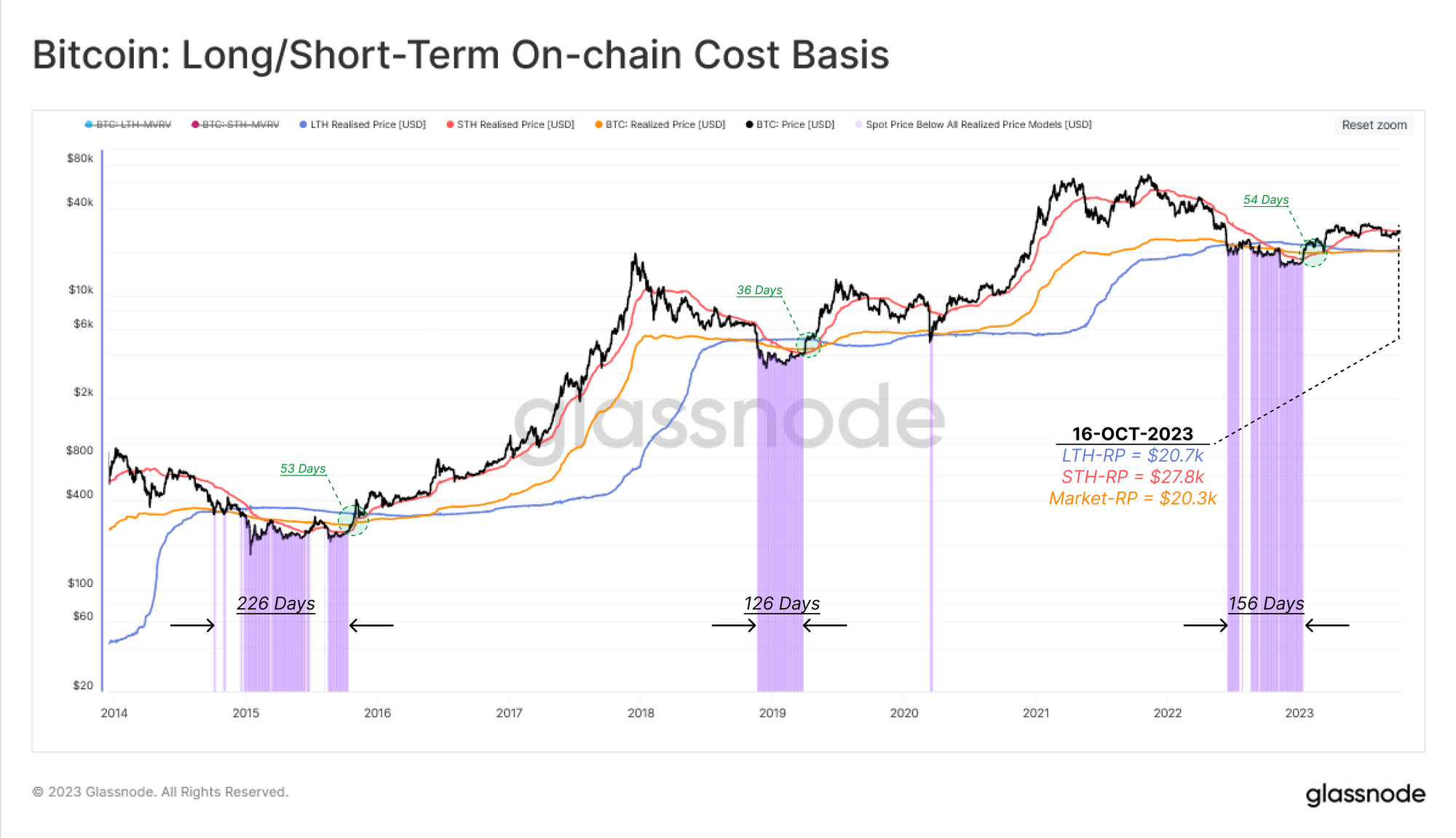
Now that we have mapped out ‘time’ component of capital rotation, we will dedicate the second part of this report to modelling this across another dimension, being the financial pressure on existing investors. We will leverage on-chain cost basis models for three cohorts:
- Short-Term Holders 🔴
- Long-Term Holders 🔵
- Market-wide 🟠
As the spot price deviates meaningfully above or below each cohort’s average cost basis, we can consider this as a growing incentive to take profits, or panic sell when their position is underwater, respectively.
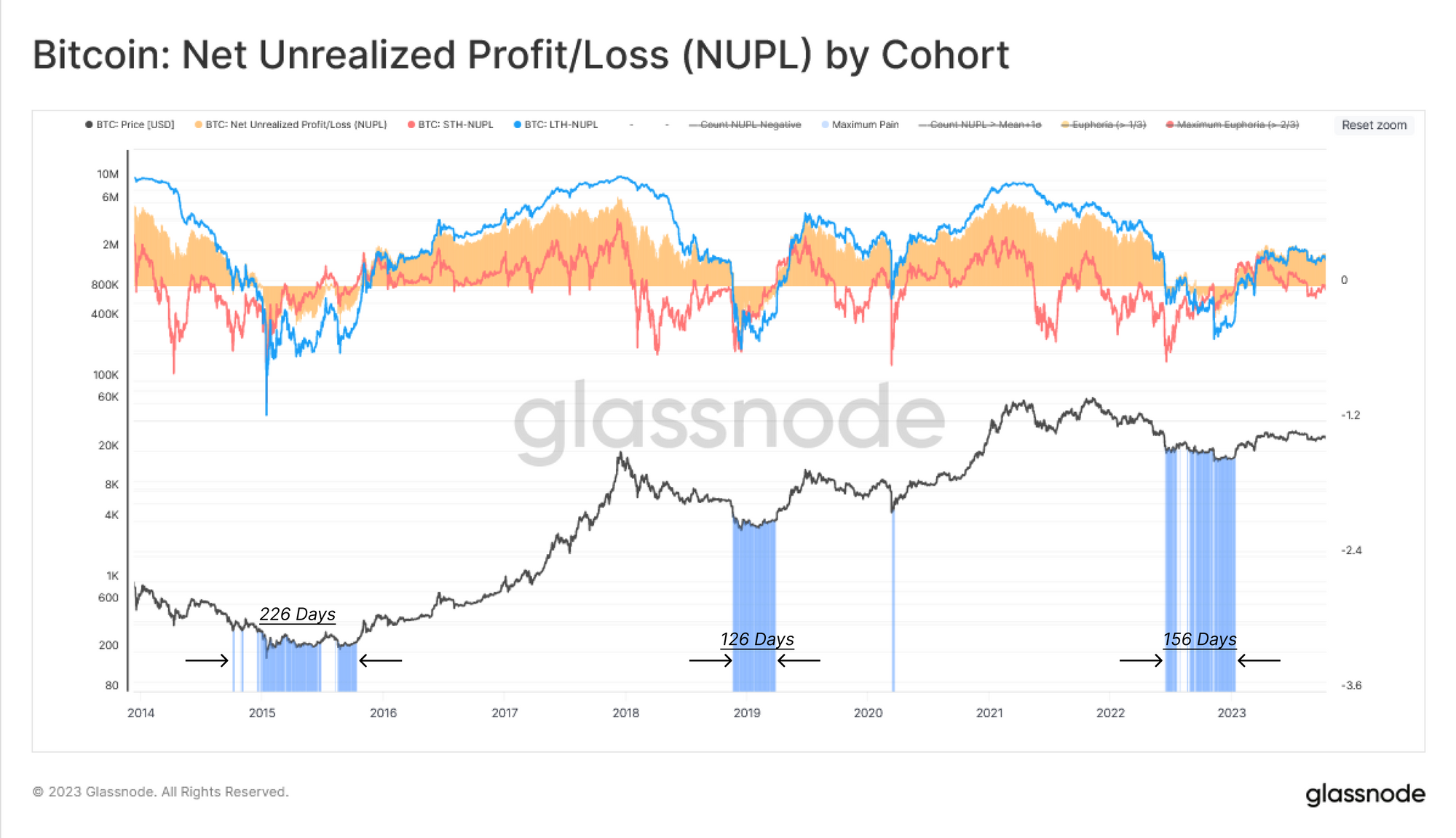
The chart below shows periods where the spot price trades below the cost basis of all three cohorts, depicting a zone of acute financial pain across the market.
Another tool to quantify the unrealized losses is using the Net Unrealized Profit/Loss (NUPL) metric. This tool will indicate when a particular cohort is holding unrealized losses (NUPL<0) or unrealized profits (NUPL>0) on average.
Both the wider market, and the Long-Term Holder NUPL are currently positive, indicating the average investor is in profit. For Short-Term Holders however, their cost basis sits at $27.8k, resulting in STH-NUPL trading just slightly above neutral. These active investors are near their break-even level, suggesting that he $28k level is an important decision point for the market.
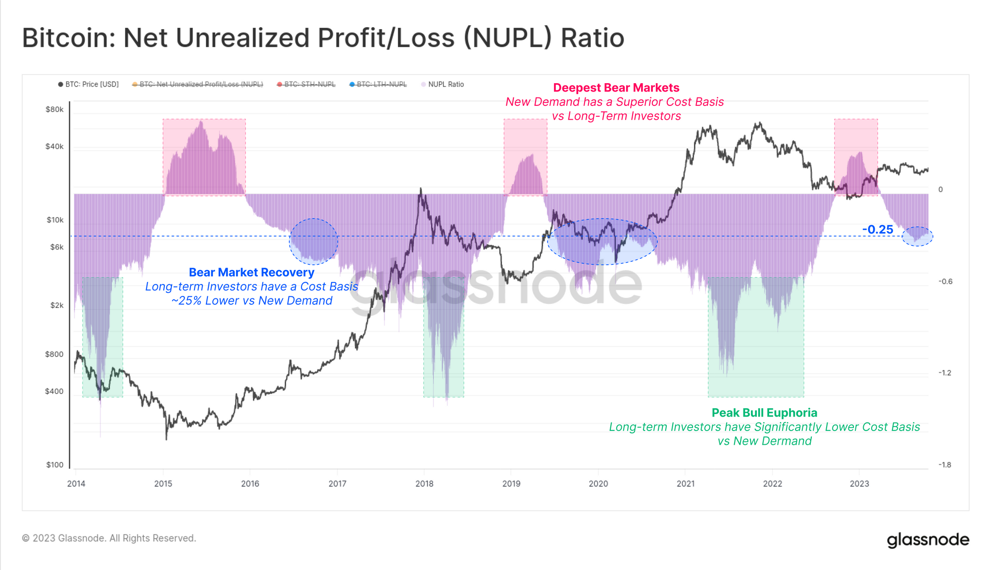
In a similar manner to the Realized Cap HODL wave analysis above, we will again take the difference between the long-term and short-term NUPL metrics to compare the financial pressure (or profit incentive) between these cohorts.
This NUPL Ratio 🟪 provides an insightful indicator for navigating market cycles based on the bias in the Existing Supply (Long-Term Investors) vs New Demand (Short-Term Investors) components. The NUPL Ratio has entered the -0.25 range in Q3 2023, which is similar again to the 2016 and 2019 periods, and typical of a bear market recovery phase.
Conclusion
In this report we expanded on the theme of capital rotation, however this time focused on the cons changing hands within the Bitcoin holder-base. We utilize the powerful set of tools available within the age bands of the Realized Cap, and isolated sub-groups thatbest describe capital rotation throughout the cycle.
By measuring the difference between the wealth held by long-term and short-term investors, we can model the ebb and flow of supply and demand forces. From this, we can see that the current market structure very much resembles the recovery phase from a major bear market, with similarities to both 2016 and 2019.
Disclaimer: This report does not provide any investment advice. All data is provided for information and educational purposes only. No investment decision shall be based on the information provided here and you are solely responsible for your own investment decisions.

- SEO Powered Content & PR Distribution. Get Amplified Today.
- PlatoData.Network Vertical Generative Ai. Empower Yourself. Access Here.
- PlatoAiStream. Web3 Intelligence. Knowledge Amplified. Access Here.
- PlatoESG. Carbon, CleanTech, Energy, Environment, Solar, Waste Management. Access Here.
- PlatoHealth. Biotech and Clinical Trials Intelligence. Access Here.
- Source: https://insights.glassnode.com/the-week-onchain-week-42-2023/