The Bitcoin Rainbow Chart has emerged as a universally used analytics tool that helps crypto investors and traders predict BTC’s ever-changing market trends and cycles.
Bitcoin Rainbow Chart BTC Analysis
Throughout the year, the price of Bitcoin has experienced several uptrends and downsides. Starting from the last three months of 2023, BTC’S price has experienced a major surge, hitting above $35,000 in October and surging past $44,000 in December.
With the market moving up rapidly, many crypto investors and market watchers look for various crypto analytics tools to enhance their understanding of the Bitcoin market trends.
The Bitcoin Rainbow Chart is one of the many analytics tools available for predicting the potential prices of BTC. This color-coded chart is a long-term valuation tool for BTC that uses a logarithmic growth curve to forecast the potential price of BTC.
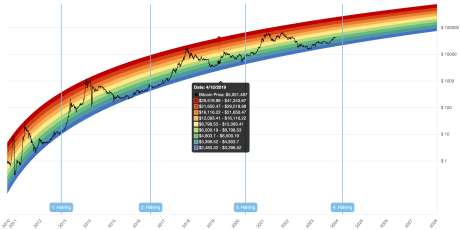
Source: Blockchain Center
Currently, according to the rainbow chart, Bitcoin is positioned around the “Accumulate” and “Still cheap” zones. This implies that the chart is showing the best timeline to purchase BTC before the selling phase begins.
The Bitcoin Rainbow Chart simplifies BTC price predictions, helping investors identify potential BTC buying and selling opportunities. However, it’s important to note that the Bitcoin Rainbow Chart is not investment advice and does not predict the exact price of Bitcoin.
BTC price readies to retest $43,000 | Source: BTCUSD On Tradingview.com
History Of The BTC Rainbow Chart
The Bitcoin Rainbow Chart first started as a fun project created by a Reddit user, Azop to visually represent Bitcoin’s price history. However, the chart became more mainstream after a second version was developed by trader Trololo and transformed into a crypto technical analysis tool.
The chart is designed using a color coding scheme and highlights each Bitcoin halving cycle and diverse BTC price ranges. With its seven color bands, the rainbow chart identifies strategic points to buy, sell, or hold BTC.
The dark red band signals a maximum bubble territory, the red band indicates a robust selling phase, while orange and yellow signify FOMO intensification and HODL periods respectively. The Green band indicates a favorable buying and accumulation window and lastly, the blue color band represents a fire sale opportunity.
While the Bitcoin Rainbow Chart does not provide financial advice, it is a widely recognized tool used by crypto traders and investors to gain a simpler understanding of BTC market movements. Ultimately, the accuracy of the chart’s predictions depends on how it is applied and in what context.
Featured image from Crypto.com, chart from Tradingview.com
Disclaimer: The article is provided for educational purposes only. It does not represent the opinions of NewsBTC on whether to buy, sell or hold any investments and naturally investing carries risks. You are advised to conduct your own research before making any investment decisions. Use information provided on this website entirely at your own risk.
- SEO Powered Content & PR Distribution. Get Amplified Today.
- PlatoData.Network Vertical Generative Ai. Empower Yourself. Access Here.
- PlatoAiStream. Web3 Intelligence. Knowledge Amplified. Access Here.
- PlatoESG. Carbon, CleanTech, Energy, Environment, Solar, Waste Management. Access Here.
- PlatoHealth. Biotech and Clinical Trials Intelligence. Access Here.
- Source: https://www.newsbtc.com/news/bitcoin/bitcoin-the-rainbow-chart/