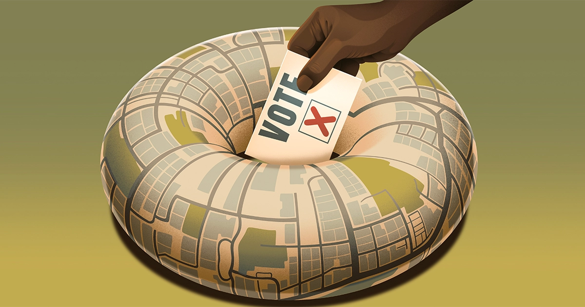
Introduction
In Georgia’s 2020 gubernatorial election, some voters in Atlanta waited over 10 hours to cast a ballot. One reason for the long lines was that almost 10% of Georgia’s polling sites had closed over the preceding seven years, despite an influx of about 2 million voters. These closures were disproportionately concentrated in predominantly Black areas that tended to vote Democratic.
But pinpointing the locations of “voting deserts” isn’t as straightforward as it might seem. Sometimes a lack of capacity is reflected in long waits at the polls, but other times the problem is the distance to the nearest polling place. Combining these factors in a systematic way is tricky.
In a paper due to be published this summer in the journal SIAM Review, Mason Porter, a mathematician at the University of California, Los Angeles, and his students used tools from topology to do just that. Abigail Hickok, one of the paper’s co-authors, conceived the idea after seeing images of long lines in Atlanta. “Voting was on my mind a lot, partly because it was an especially anxiety-inducing election,” she said.
Topologists study the underlying properties and spatial relations of geometric shapes under transformation. Two shapes are considered topologically equivalent if one can deform into the other via continuous movements without tearing, gluing, or introducing new holes.
At first glance, topology would seem to be a poor fit for the problem of polling site placement. Topology concerns itself with continuous shapes, and polling sites are at discrete locations. But in recent years, topologists have adapted their tools to work on discrete data by creating graphs of points connected by lines and then analyzing the properties of those graphs. Hickok said these techniques are useful not only for understanding the distribution of polling places but also for studying who has better access to hospitals, grocery stores and parks.
That’s where the topology begins.
Imagine creating tiny circles around each point on the graph. The circles start with a radius of zero, but they grow with time. Specifically, when the time exceeds the wait time at a given polling place, the circle will begin to expand. As a consequence, locations with shorter wait times will have bigger circles — they start growing first — and locations with longer wait times will have smaller ones.
Some circles will eventually touch each other. When this happens, draw a line between the points at their centers. If multiple circles overlap, connect all those points into “simplices,” which is just a general term meaning shapes such as triangles (a 2-simplex) and tetrahedrons (3-simplex).
Introduction
These shapes reveal the geographic locations where residents would have had time to vote. Empty areas completely surrounded by the shapes are called holes. The holes are where residents would be either making their way to the polls or waiting in line to vote. Eventually, as the time increases, all the holes will disappear. If a hole takes a long time to disappear, or, in mathematical parlance, “die,” it means a geographical area lacks reasonable access to the polls.
For each city, the researchers determined the median “death time” and variance. A high median indicates that there aren’t enough polling places in the city; a high variance means that access to the polls is uneven. Chicago had some of the lowest median death times; New York and Atlanta had some of the highest. The researchers also looked for neighborhoods that were conspicuous outliers. They found that a swath of the greater Atlanta metropolitan area that includes the cities of South Fulton and Cliftondale had the highest “death value” in the whole study, indicating that this was a particularly tough place to vote.
Porter wants to get more granular data on wait times — the dataset they used was averaged over districts rather than for individual polling precincts. Still, Chad Topaz, a mathematician at Williams College who was not involved in the study, said the group was able to extract an impressive amount of information despite the dataset’s limitations. “They’re figuring something out about coverage despite not thinking about each individual’s accessibility to each different polling site,” said Topaz.
Porter notes that mathematicians have had success using sophisticated mathematical techniques to quantify gerrymandering, the deliberate skewing of legislative districts. He sees the progress made over the past decade in the math of gerrymandering as a model to emulate. “We’re at the humble beginnings right now,” he said. “I do want to see more people working on these problems.”
Correction: March 26, 2024
An earlier version of this article misspelled Abigail Hickok’s last name.
- SEO Powered Content & PR Distribution. Get Amplified Today.
- PlatoData.Network Vertical Generative Ai. Empower Yourself. Access Here.
- PlatoAiStream. Web3 Intelligence. Knowledge Amplified. Access Here.
- PlatoESG. Carbon, CleanTech, Energy, Environment, Solar, Waste Management. Access Here.
- PlatoHealth. Biotech and Clinical Trials Intelligence. Access Here.
- Source: https://www.quantamagazine.org/topologists-tackle-the-trouble-with-poll-placement-20240326/