If you are a business analyst, understanding customer behavior is probably one of the most important things you care about. Understanding the reasons and mechanisms behind customer purchase decisions can facilitate revenue growth. However, the loss of customers (commonly referred to as customer churn) always poses a risk. Gaining insights into why customers leave can be just as crucial for sustaining profits and revenue.
Although machine learning (ML) can provide valuable insights, ML experts were needed to build customer churn prediction models until the introduction of Amazon SageMaker Canvas.
SageMaker Canvas is a low-code/no-code managed service that allows you to create ML models that can solve many business problems without writing a single line of code. It also enables you to evaluate the models using advanced metrics as if you were a data scientist.
In this post, we show how a business analyst can evaluate and understand a classification churn model created with SageMaker Canvas using the Advanced metrics tab. We explain the metrics and show techniques to deal with data to obtain better model performance.
Prerequisites
If you would like to implement all or some of the tasks described in this post, you need an AWS account with access to SageMaker Canvas. Refer to Predict customer churn with no-code machine learning using Amazon SageMaker Canvas to cover the basics around SageMaker Canvas, the churn model, and the dataset.
Introduction to model performance evaluation
As a general guideline, when you need to evaluate the performance of a model, you’re trying to measure how well the model will predict something when it sees new data. This prediction is called inference. You start by training the model using existing data, and then ask the model to predict the outcome on data that it has not already seen. How accurately the model predicts this outcome is what you look at to understand the model performance.
If the model hasn’t seen the new data, how would anybody know if the prediction is good or bad? Well, the idea is to actually use historical data where the results are already known and compare the these values to the model’s predicted values. This is enabled by setting aside a portion of the historical training data so it can be compared with what the model predicts for those values.
In the example of customer churn (which is a categorical classification problem), you start with a historical dataset that describes customers with many attributes (one in each record). One of the attributes, called Churn, can be True or False, describing if the customer left the service or not. To evaluate model accuracy, we split this dataset and train the model using one part (the training dataset), and ask the model to predict the outcome (classify the customer as Churn or not) with the other part (the test dataset). We then compare the model’s prediction to the ground truth contained in the test dataset.
Interpreting advanced metrics
In this section, we discuss the advanced metrics in SageMaker Canvas that can help you understand model performance.
Confusion matrix
SageMaker Canvas uses confusion matrices to help you visualize when a model generates predictions correctly. In a confusion matrix, your results are arranged to compare the predicted values against the actual historical (known) values. The following example explains how a confusion matrix works for a two-category prediction model that predicts positive and negative labels:
- True positive – The model correctly predicted positive when the true label was positive
- True negative – The model correctly predicted negative when the true label was negative
- False positive – The model incorrectly predicted positive when the true label was negative
- False negative – The model incorrectly predicted negative when the true label was positive
The following image is an example of a confusion matrix for two categories. In our churn model, the actual values come from the test dataset, and the predicted values come from asking our model.

Accuracy
Accuracy is the percentage of correct predictions out of all the rows or samples of the test set. It is the true samples that were predicted as True, plus the false samples that were correctly predicted as False, divided by the total number of samples in the dataset.
It’s one of the most important metrics to understand because it will tell you in what percentage the model correctly predicted, but it can be misleading in some cases. For example:
- Class imbalance – When the classes in your dataset are not evenly distributed (you have a disproportionate number of samples from one class and very little on others), accuracy can be misleading. In such cases, even a model that simply predicts the majority class for every instance can achieve a high accuracy.
- Cost-sensitive classification – In some applications, the cost of misclassification for different classes can be different. For example, if we were predicting if a drug can aggravate a condition, a false negative (for example, predicting the drug might not aggravate when it actually does) can be more costly than a false positive (for example, predicting the drug might aggravate when it actually does not).
Precision, recall, and F1 score
Precision is the fraction of true positives (TP) out of all the predicted positives (TP + FP). It measures the proportion of positive predictions that are actually correct.
Recall is the fraction of true positives (TP) out of all the actual positives (TP + FN). It measures the proportion of positive instances that were correctly predicted as positive by the model.
The F1 score combines precision and recall to provide a single score that balances the trade-off between them. It is defined as the harmonic mean of precision and recall:
F1 score = 2 * (precision * recall) / (precision + recall)
The F1 score ranges from 0–1, with a higher score indicating better performance. A perfect F1 score of 1 indicates that the model has achieved both perfect precision and perfect recall, and a score of 0 indicates that the model’s predictions are completely wrong.
The F1 score provides a balanced evaluation of the model’s performance. It considers precision and recall, providing a more informative evaluation metric that reflects the model’s ability to correctly classify positive instances and avoid false positives and false negatives.
For example, in medical diagnosis, fraud detection, and sentiment analysis, F1 is especially relevant. In medical diagnosis, accurately identifying the presence of a specific disease or condition is crucial, and false negatives or false positives can have significant consequences. The F1 score takes into account both precision (the ability to correctly identify positive cases) and recall (the ability to find all positive cases), providing a balanced evaluation of the model’s performance in detecting the disease. Similarly, in fraud detection, where the number of actual fraud cases is relatively low compared to non-fraudulent cases (imbalanced classes), accuracy alone may be misleading due to a high number of true negatives. The F1 score provides a comprehensive measure of the model’s ability to detect both fraudulent and non-fraudulent cases, considering both precision and recall. And in sentiment analysis, if the dataset is imbalanced, accuracy may not accurately reflect the model’s performance in classifying instances of the positive sentiment class.
AUC (area under the curve)
The AUC metric evaluates the ability of a binary classification model to distinguish between positive and negative classes at all classification thresholds. A threshold is a value used by the model to make a decision between the two possible classes, converting the probability of a sample being part of a class into a binary decision. To calculate the AUC, the true positive rate (TPR) and false positive rate (FPR) are plotted across various threshold settings. The TPR measures the proportion of true positives out of all actual positives, while the FPR measures the proportion of false positives out of all actual negatives. The resulting curve, called the receiver operating characteristic (ROC) curve, provides a visual representation of the TPR and FPR at different threshold settings. The AUC value, which ranges from 0–1, represents the area under the ROC curve. Higher AUC values indicate better performance, with a perfect classifier achieving an AUC of 1.
The following plot shows the ROC curve, with TPR as the Y axis and FPR as the X axis. The closer the curve gets to the top left corner of the plot, the better the model does at classifying the data into categories.

To clarify, let’s go over an example. Let’s think about a fraud detection model. Usually, these models are trained from unbalanced datasets. This is due to the fact that, usually, almost all the transactions in the dataset are non-fraudulent with only a few labeled as frauds. In this case, the accuracy alone may not adequately capture the performance of the model because it is probably heavily influenced by the abundance of non-fraudulent cases, leading to misleadingly high accuracy scores.
In this case, the AUC would be a better metric to assess model performance because it provides a comprehensive assessment of a model’s ability to distinguish between fraudulent and non-fraudulent transactions. It offers a more nuanced evaluation, taking into account the trade-off between true positive rate and false positive rate at various classification thresholds.
Just like the F1 score, it is particularly useful when the dataset is imbalanced. It measures the trade-off between TPR and FPR and shows how well the model can differentiate between the two classes regardless of their distribution. This means that even if one class is significantly smaller than the other, the ROC curve assesses the model’s performance in a balanced manner by considering both classes equally.
Additional key topics
Advanced metrics are not the only important tools available to you for evaluating and improving ML model performance. Data preparation, feature engineering, and feature impact analysis are techniques that are essential to model building. These activities play a crucial role in extracting meaningful insights from raw data and improving model performance, leading to more robust and insightful results.
Data preparation and feature engineering
Feature engineering is the process of selecting, transforming, and creating new variables (features) from raw data, and plays a key role in improving the performance of an ML model. Selecting the most relevant variables or features from the available data involves removing irrelevant or redundant features that do not contribute to the model’s predictive power. Transforming data features into a suitable format includes scaling, normalization, and handling missing values. And finally, creating new features from the existing data is done through mathematical transformations, combining or interacting different features, or creating new features from domain-specific knowledge.
Feature importance analysis
SageMaker Canvas generates a feature importance analysis that explains the impact that each column in your dataset has on the model. When you generate predictions, you can see the column impact that identifies which columns have the most impact on each prediction. This will give you insights on which features deserve to be part of your final model and which ones should be discarded. Column impact is a percentage score that indicates how much weight a column has in making predictions in relation to the other columns. For a column impact of 25%, Canvas weighs the prediction as 25% for the column and 75% for the other columns.
Approaches to improve model accuracy
Although there are multiple methods to improve model accuracy, data scientists and ML practitioners usually follow one of the two approaches discussed in this section, using the tools and metrics described earlier.
Model-centric approach
In this approach, the data always remains the same and is used to iteratively improve the model to meet desired results. Tools used with this approach include:
- Trying multiple relevant ML algorithms
- Algorithm and hyperparameter tuning and optimization
- Different model ensemble methods
- Using pre-trained models (SageMaker provides various built-in or pre-trained models to help ML practitioners)
- AutoML, which is what SageMaker Canvas does behind the scenes (using Amazon SageMaker Autopilot), which encompasses all of the above
Data-centric approach
In this approach, the focus is on data preparation, improving data quality, and iteratively modifying the data to improve performance:
- Exploring statistics of the dataset used to train the model, also known as exploratory data analysis (EDA)
- Improving data quality (data cleaning, missing values imputation, outlier detection and management)
- Feature selection
- Feature engineering
- Data augmentation
Improving model performance with Canvas
We begin with the data-centric approach. We use the model preview functionality to perform an initial EDA. This provides us a baseline that we can use to perform data augmentation, generating a new baseline, and finally getting the best model with a model-centric approach using the standard build functionality.
We use the synthetic dataset from a telecommunications mobile phone carrier. This sample dataset contains 5,000 records, where each record uses 21 attributes to describe the customer profile. Refer to Predict customer churn with no-code machine learning using Amazon SageMaker Canvas for a full description.
Model preview in a data-centric approach
As a first step, we open the dataset, select the column to predict as Churn?, and generate a preview model by choosing Preview model.

The Preview model pane will show the progress until the preview model is ready.

When the model is ready, SageMaker Canvas generates a feature importance analysis.

Finally, when it’s complete, the pane will show a list of columns with its impact on the model. These are useful to understand how relevant the features are on our predictions. Column impact is a percentage score that indicates how much weight a column has in making predictions in relation to the other columns. In the following example, for the Night Calls column, SageMaker Canvas weights the prediction as 4.04% for the column and 95.9% for the other columns. The higher the value, the higher the impact.
As we can see, the preview model has a 95.6% accuracy. Let’s try to improve the model performance using a data-centric approach. We perform data preparation and use feature engineering techniques to improve performance.
As shown in the following screenshot, we can observe that the Phone and State columns have much less impact on our prediction. Therefore, we will use this information as input for our next phase, data preparation.

SageMaker Canvas provides ML data transforms with which you can clean, transform, and prepare your data for model building. You can use these transforms on your datasets without any code, and they will be added to the model recipe, which is a record of the data preparation performed on your data before building the model.
Note that any data transforms you use only modify the input data when building a model and do not modify your dataset or original data source.
The following transforms are available in SageMaker Canvas for you to prepare your data for building:
- Datetime extraction
- Drop columns
- Filter rows
- Functions and operators
- Manage rows
- Rename columns
- Remove rows
- Replace values
- Resample time series data
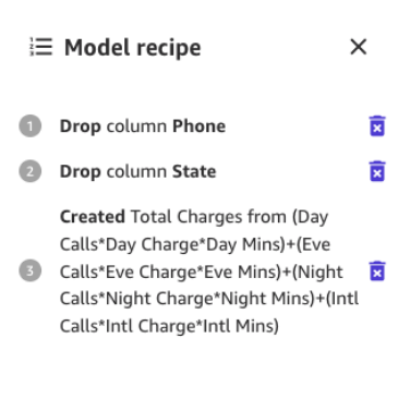
Let’s start by dropping the columns we have found that have little impact on our prediction.
For example, in this dataset, the phone number is just the equivalent of an account number—it’s useless or even detrimental in predicting other accounts’ likelihood of churn. Likewise, the customer’s state doesn’t impact our model much. Let’s remove the Phone and State columns by unselecting those features under Column name.

Now, let’s perform some additional data transformation and feature engineering.
For example, we noticed in our previous analysis that the charged amount to customers has a direct impact on churn. Let’s therefore create a new column that computes the total charges to our customers by combining Charge, Mins, and Calls for Day, Eve, Night, and Intl. To do so, we use the custom formulas in SageMaker Canvas.

Let’s start by choosing Functions, then we add to the formula textbox the following text:
(Day Calls*Day Charge*Day Mins)+(Eve Calls*Eve Charge*Eve Mins)+(Night Calls*Night Charge*Night Mins)+(Intl Calls*Intl Charge*Intl Mins)
Give the new column a name (for example, Total Charges), and choose Add after the preview has been generated. The model recipe should now look as shown in the following screenshot.
When this data preparation is complete, we train a new preview model to see if the model improved. Choose Preview model again, and the lower right pane will show the progress.

When training is finished, it will proceed to recompute the predicted accuracy, and will also create a new column impact analysis.

And finally, when the whole process is complete, we can see the same pane we saw earlier but with the new preview model accuracy. You can notice model accuracy increased by 0.4% (from 95.6% to 96%).

The numbers in the preceding images may differ from yours because ML introduces some stochasticity in the process of training models, which can lead to different results in different builds.
Model-centric approach to create the model
Canvas offers two options to build your models:
- Standard build – Builds the best model from an optimized process where speed is exchanged for better accuracy. It uses Auto-ML, which automates various tasks of ML, including model selection, trying various algorithms relevant to your ML use case, hyperparameter tuning, and creating model explainability reports.
- Quick build – Builds a simple model in a fraction of the time compared to a standard build, but accuracy is exchanged for speed. Quick model is useful when iterating to more quickly understand the impact of data changes to your model accuracy.
Let’s continue using a standard build approach.
Standard build
As we saw before, the standard build builds the best model from an optimized process to maximize accuracy.

The build process for our churn model takes around 45 minutes. During this time, Canvas tests hundreds of candidate pipelines, selecting the best model. In the following screenshot, we can see the expected build time and progress.
With the standard build process, our ML model has improved our model accuracy to 96.903%, which is a significant improvement.

Explore advanced metrics
Let’s explore the model using the Advanced metrics tab. On the Scoring tab, choose Advanced metrics.

This page will show the following confusion matrix jointly with the advanced metrics: F1 score, accuracy, precision, recall, F1 score, and AUC.

Generate predictions
Now that the metrics look good, we can perform an interactive prediction on the Predict tab, either in a batch or single (real-time) prediction.
We have two options:
- Use this model to run to run batch or single predictions
- Send the model to Amazon Sagemaker Studio to share with data scientists
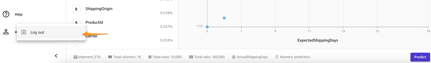
Clean up
To avoid incurring future session charges, log out of SageMaker Canvas.
Conclusion
SageMaker Canvas provides powerful tools that enable you to build and assess the accuracy of models, enhancing their performance without the need for coding or specialized data science and ML expertise. As we have seen in the example through the creation of a customer churn model, by combining these tools with both a data-centric and a model-centric approach using advanced metrics, business analysts can create and evaluate prediction models. With a visual interface, you’re also empowered to generate accurate ML predictions on your own. We encourage you to go through the references and see how many of these concepts might apply in other types of ML problems.
References
About the Authors
 Marcos is an AWS Sr. Machine Learning Solutions Architect based in Florida, US. In that role, he is responsible for guiding and assisting US startup organizations in their strategy towards the cloud, providing guidance on how to address high-risk issues and optimize their machine learning workloads. He has more than 25 years of experience with technology, including cloud solution development, machine learning, software development, and data center infrastructure.
 Indrajit is an AWS Enterprise Sr. Solutions Architect. In his role, he helps customers achieve their business outcomes through cloud adoption. He designs modern application architectures based on microservices, serverless, APIs, and event-driven patterns. He works with customers to realize their data analytics and machine learning goals through adoption of DataOps and MLOps practices and solutions. Indrajit speaks regularly at AWS public events like summits and ASEAN workshops, has published several AWS blog posts, and developed customer-facing technical workshops focused on data and machine learning on AWS.
- SEO Powered Content & PR Distribution. Get Amplified Today.
- PlatoData.Network Vertical Generative Ai. Empower Yourself. Access Here.
- PlatoAiStream. Web3 Intelligence. Knowledge Amplified. Access Here.
- PlatoESG. Automotive / EVs, Carbon, CleanTech, Energy, Environment, Solar, Waste Management. Access Here.
- BlockOffsets. Modernizing Environmental Offset Ownership. Access Here.
- Source: https://aws.amazon.com/blogs/machine-learning/is-your-model-good-a-deep-dive-into-amazon-sagemaker-canvas-advanced-metrics/