Executive Summary
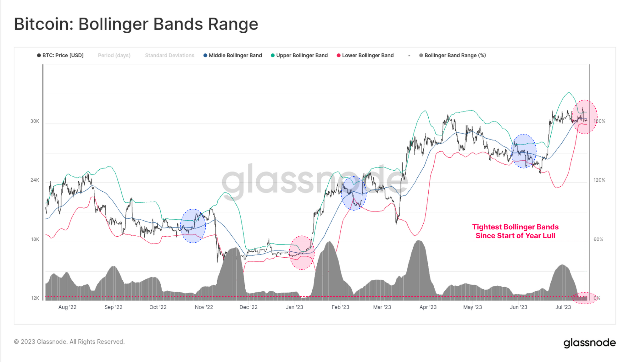
- Despite BTC setting a temporary yearly price high of $31.7k, the market remains extremely quiet, with the Bollinger Bands now separated by a price range of just 4.2%.
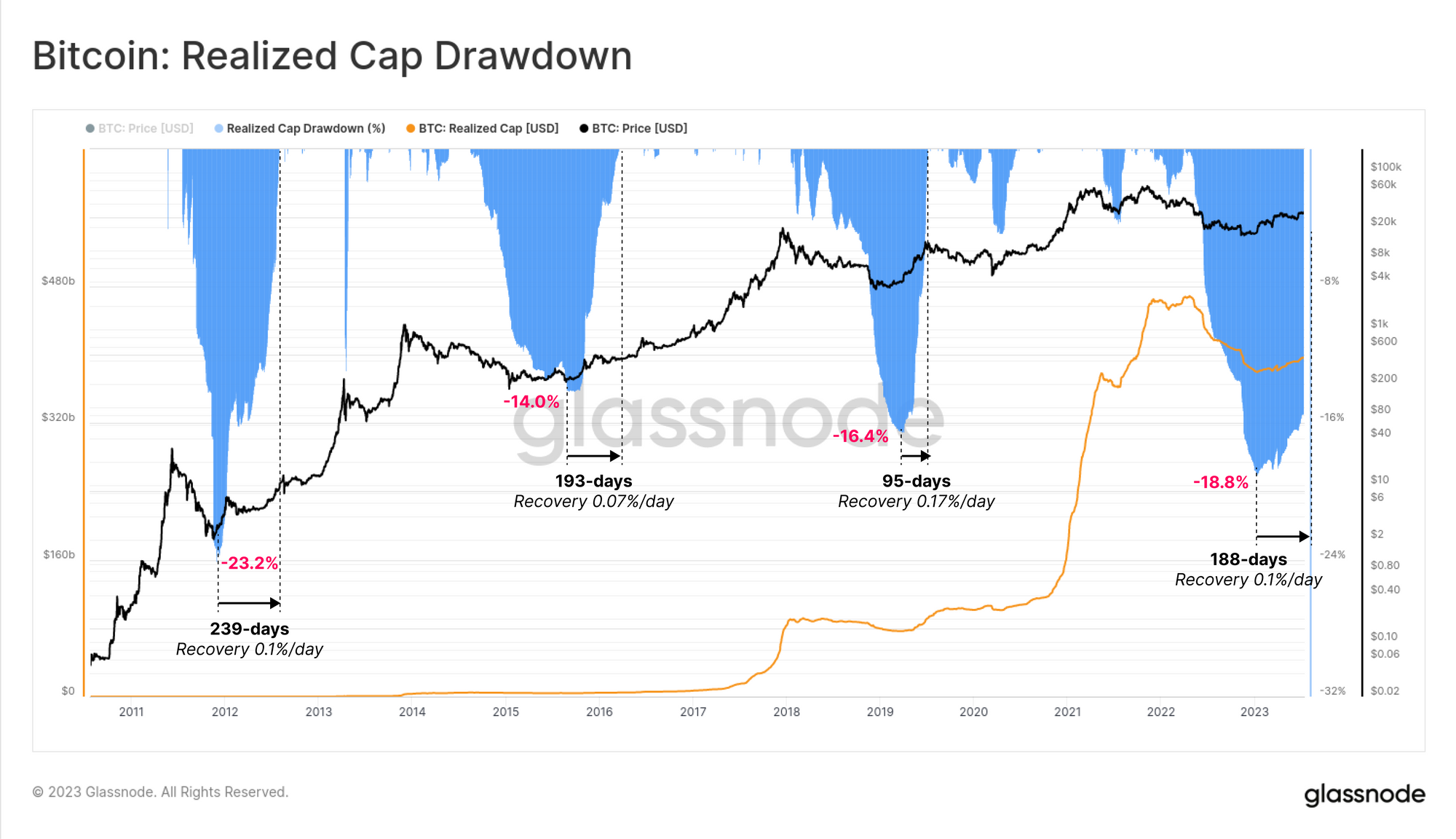
- The realized cap is hovering just below $400B, experiencing a steady but slow inflow of capital into digital assets, led primarily by the major two assets BTC and ETH.
- The market is firmly within a regime of profit dominance, however the magnitude of USD value locked in remains near cycle lows, and investors remain unwilling to part with their held supply.
- Several metrics now resemble the choppy market conditions seen in the 2016 and 2019-20 periods.
Slow and Steady Inflows
The digital asset market continues to see remarkably little volatility, with the classic 20-day Bollinger Bands experiencing an extreme squeeze. Despite setting a temporary yearly high of $31.7k this week, the rally failed to sustain momentum, bringing BTC prices back into the sideways trading range above $30.0k.
A price range of just 4.2% separates the upper and lower Bollinger bands, making this is the quietest BTC market since the lull in early January.
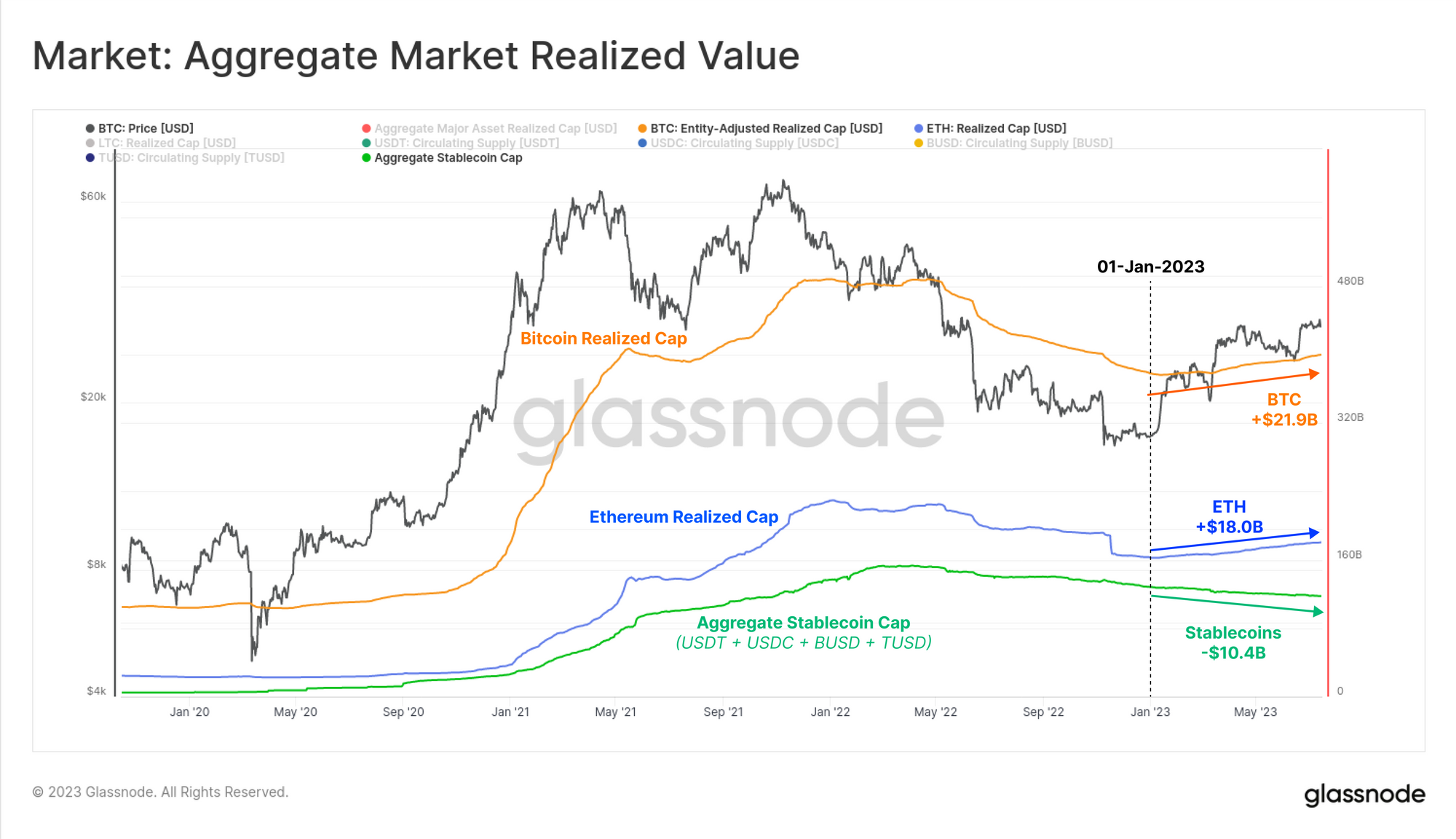
Beneath the surface, capital is still flowing into digital assets at a steady and modest rate. The Realized Cap is one of the oldest and most widely observed on-chain metrics, and provides a powerful tool for assessing the true capital flows into Bitcoin. It is best thought of as the ‘on-chain Market Cap’, and reflects the cumulative sum of all realized profit and loss events through history.
The Realized Cap currently sits just shy of $400B and has indicates that a steady stream of capital is entering the asset throughout 2023. As the realized cap climbs, it signals that coins are changing hands at higher prices on net, suggesting a modest uptick in new demand inflow this year.

During bear markets, Bitcoin usually experiences significant capital outflows, as investors lock in losses. The realized cap drawdown in 2022 reached the second deepest value of -18.8%, demonstrating the magnitude of the bear market. Recovery of the realized cap ATH in prior cycles have taken between 95 and 239-days, with the recovery so far occurring at a similar rate.
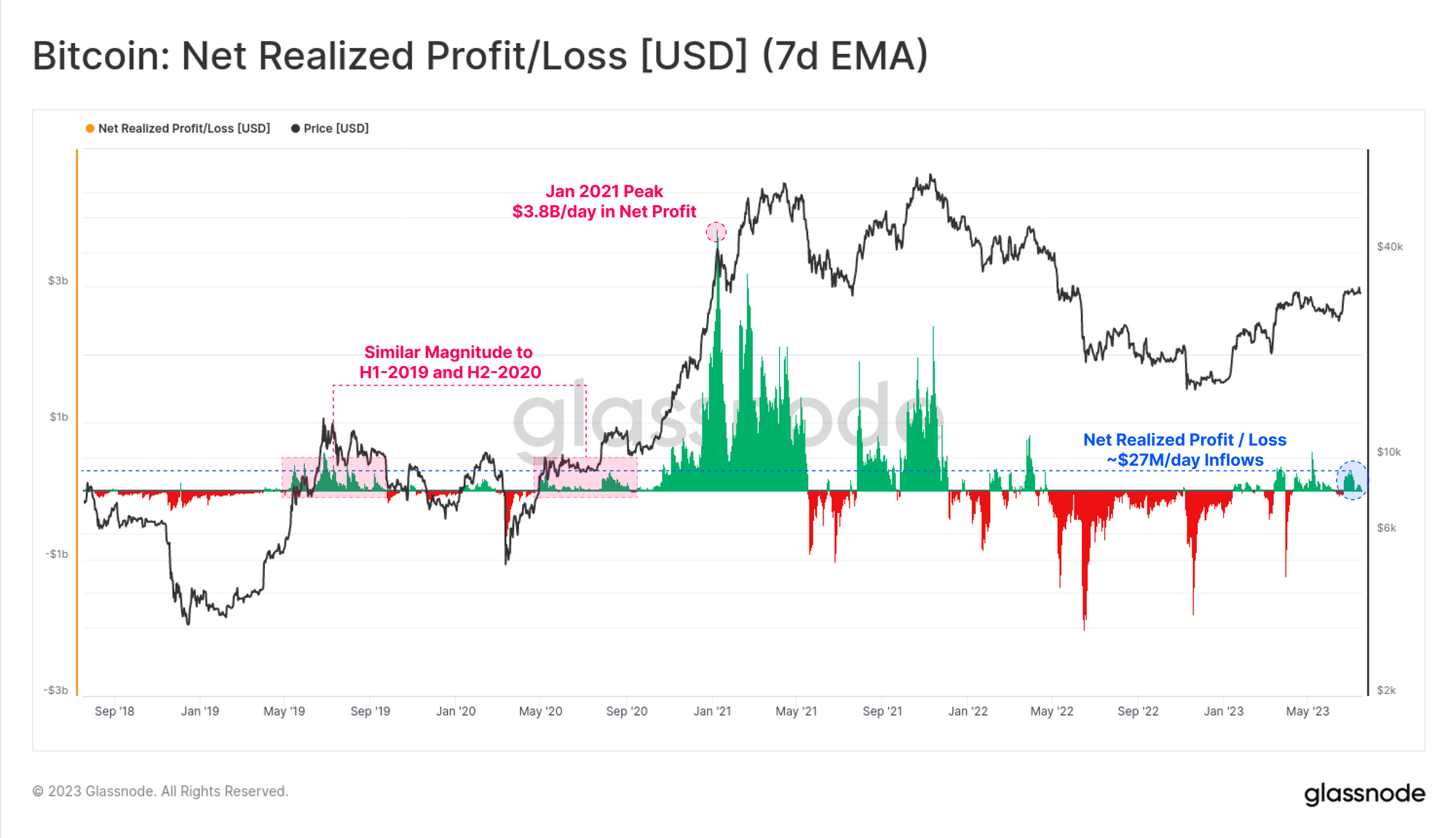
Shifts in demand liquidity can also be assessed via the Net Realized Profit / Loss (NRPL) metric, which is the first derivative of the Realized Cap.
NRPL has traded within a profit dominated regime through much of 2023, seeing around $270M/day in net inflows (profits minus losses). This reflects the first sustained profit regime since April 2022. This is similar in scale to both the first half of 2019, and also late 2020, which is a comparison which this report will show from several angles.
Of note is how significantly smaller this regime is compared the 2021 bull market which reached extraordinary peaks of over $3.68B/day.
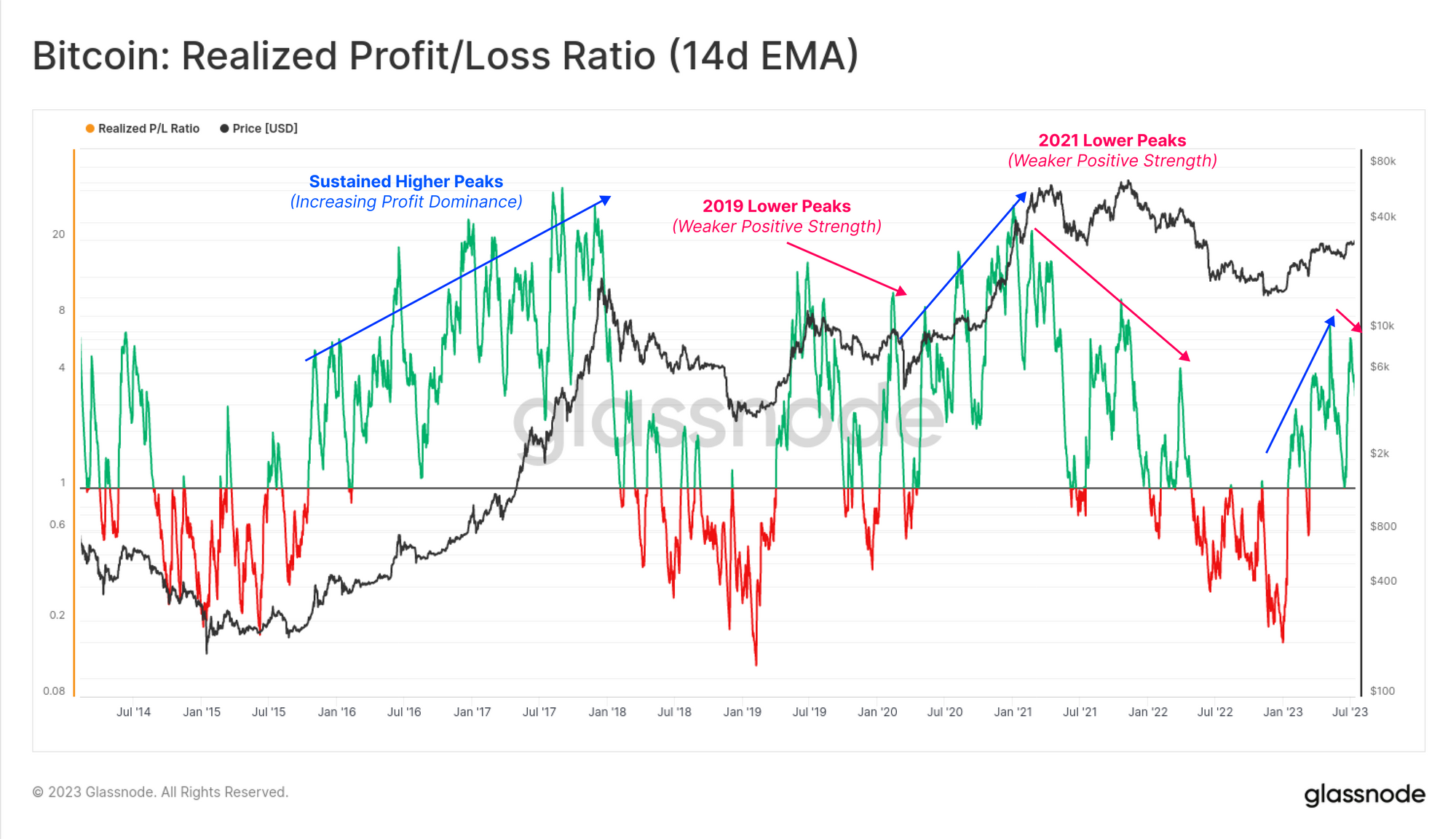
If we take a ratio between total realized profit and loss, we can see that 2023 has been an explosive and positive year thus far, breaking firmly above the breakeven level of 1.0 in early January.
However, we can also note that a lower high in this ratio was set this week. If sustained, it may allude to similar choppy market conditions seen in both 2019-20, and again in the second half of 2021. Lower peaks in this metric generally suggest a marginal softening of capital inflows, which in the past has preceded a longer period of time to digest the recovery.
We can also gauge shifts across the wider digital asset market by comparing the Bitcoin and Etheruem Realized Caps, with the supply of the top stablecoins. By this measure we can see that most capital flows have come in via the two majors BTC and ETH, both seeing inflows of +$21.9B and $18.0B YTD, respectively.
Stablecoins however have seen a net reduction of -$10.4B in aggregate supply, led largely by USDC and BUSD redemptions. This trend is now firmly in place, suggesting a notable market preference for the big two digital assets over stablecoin capital.
The Incentive to Spend
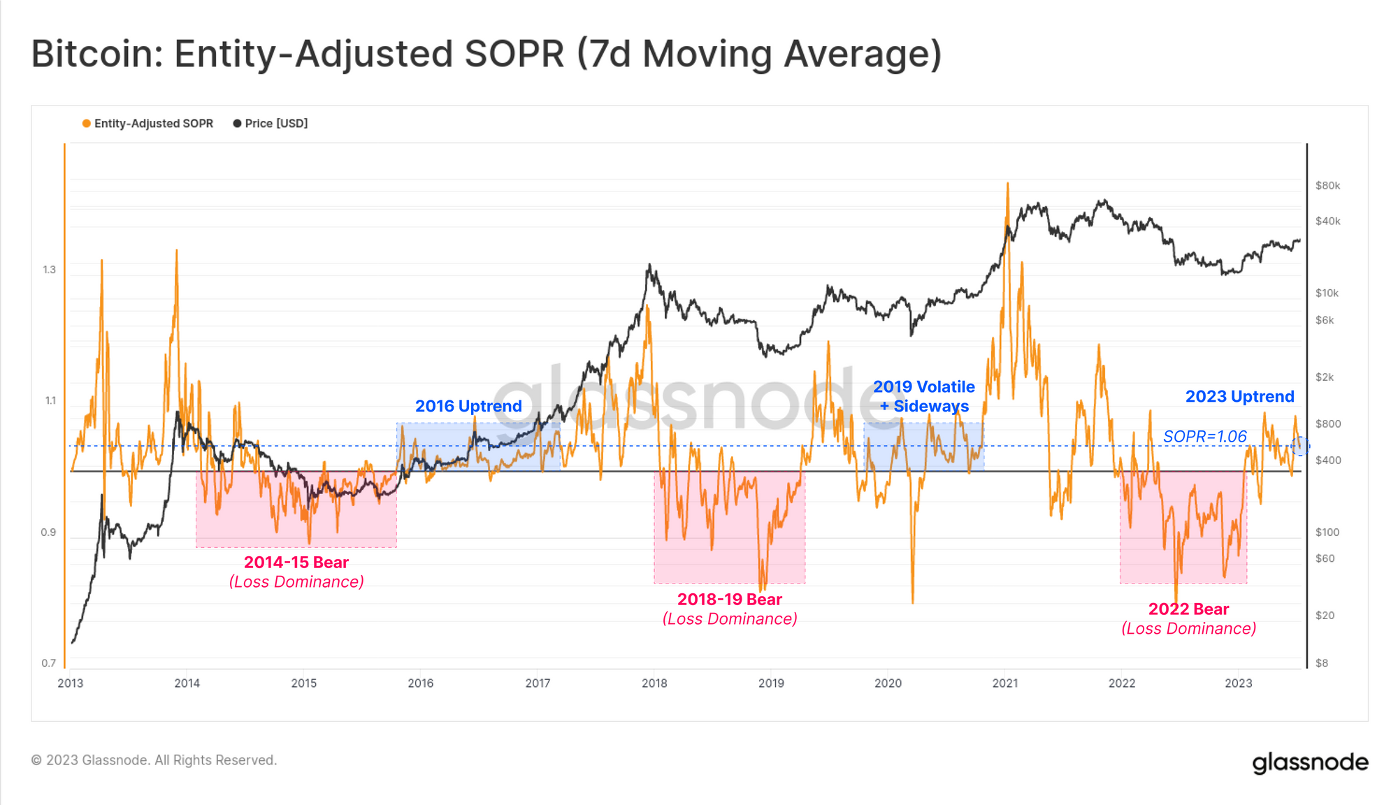
SOPR is another powerful tool, useful for for tracking the magnitude of profit and loss taking events across the market. Here, we define a framework consisting of two binary regimes to characterise market behaviour:
- Loss Dominant Regime: Successive prints below 1.0 are indicative of investors locking in losses, and returns to the breakeven level are often utilized as exit point (forming resistance).
- Profit Dominant Regime: Successive SOPR prints above 1.0 indicates a return of profit taking, and returns to the breakeven level are often considered a near term point of value (forming support).
SOPR currently resides within a profit dominant regime, recording a value of 1.06, indicating the average coin changing hands is locking in a 6% profit. This again has similar characteristics to the 2016 and 2019 periods.
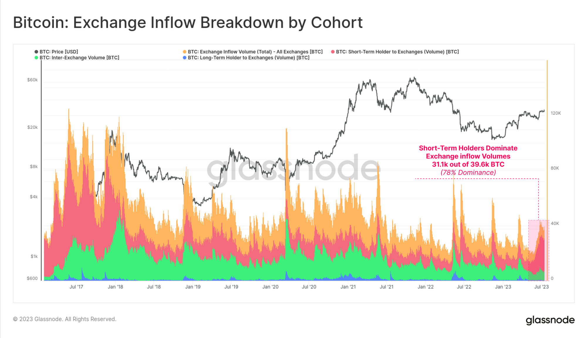
With this in mind, the breakdown of exchange inflow volumes suggest that Short-Term Holders (STH) are the primary entities that are active in the market. Out of the total 39.6k BTC in daily exchange inflows, 78% of this is associated with the STH cohort, being those investors that have been active since early February.
💱
This makes sense when we contextualize the proportion of STH supply that is held in profit, which is now just over 88% of their total balance. This is above the mean plus one standard deviation level, and is historically associated with macro uptrends where the incentive to take profits is high.
As prices rise, the STH cohort are becoming increasingly likely to spend and take profits.
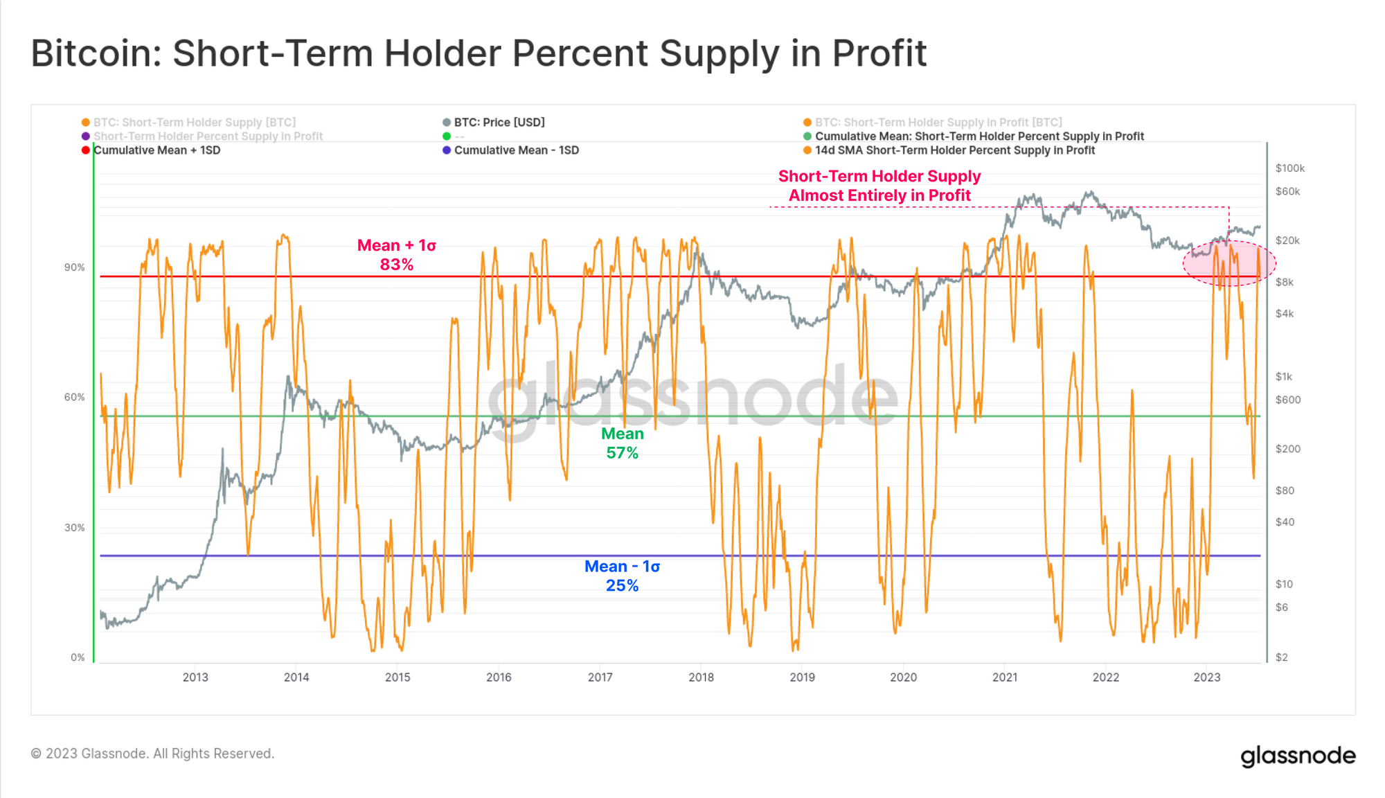
If we compare this to the Long-Term Holder cohort (LTHs), we can see their position is comparatively less extreme, with just over 73% of their balance held in profit. This indicates that around a quarter of all LTH supply was acquired at prices above than $30k and within the 2021-22 cycle (as covered in last weeks edition WoC 28).
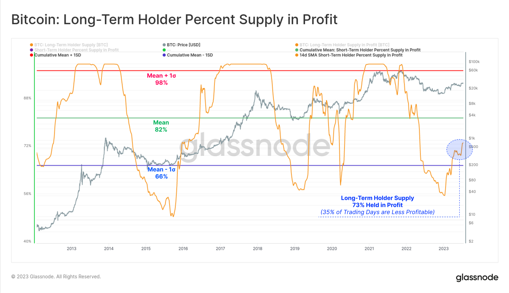
If we breakdown the realized value locked in by the market, we can see the strength of the 2023 recovery thus far. Both LTHs and STHs are now seeing the super-majority (73%) of their spending locking in a profit.
This is a significant improvement over the extreme pain experienced after FTX failed, where 90% of all spent coins were locking in losses (the deepest capitulation in history by this measure).
However, if we view this from the lens of total USD denominated realized value (profit plus loss), it remains near cycle lows of just $290M/day. Whilst this is a significant sum on a nominal basis, it is again comparable to the 2019 peak, and to October 2020 where BTC prices were 50% lower than they currently are.
As such, it suggests that even though the Bitcoin market cap is ~2x larger today, investors who are holding large profits or losses are extremely unwilling to spend their coins on-chain.

Overall, this suggests that the vast majority of Bitcoin holders are sitting tight, and are opting not to revalue their holdings. This speaks to our prior report (WoC 26) where the proportion of liquid, mobile and active BTC available on the market remains remarkably small.
Seeing the Light
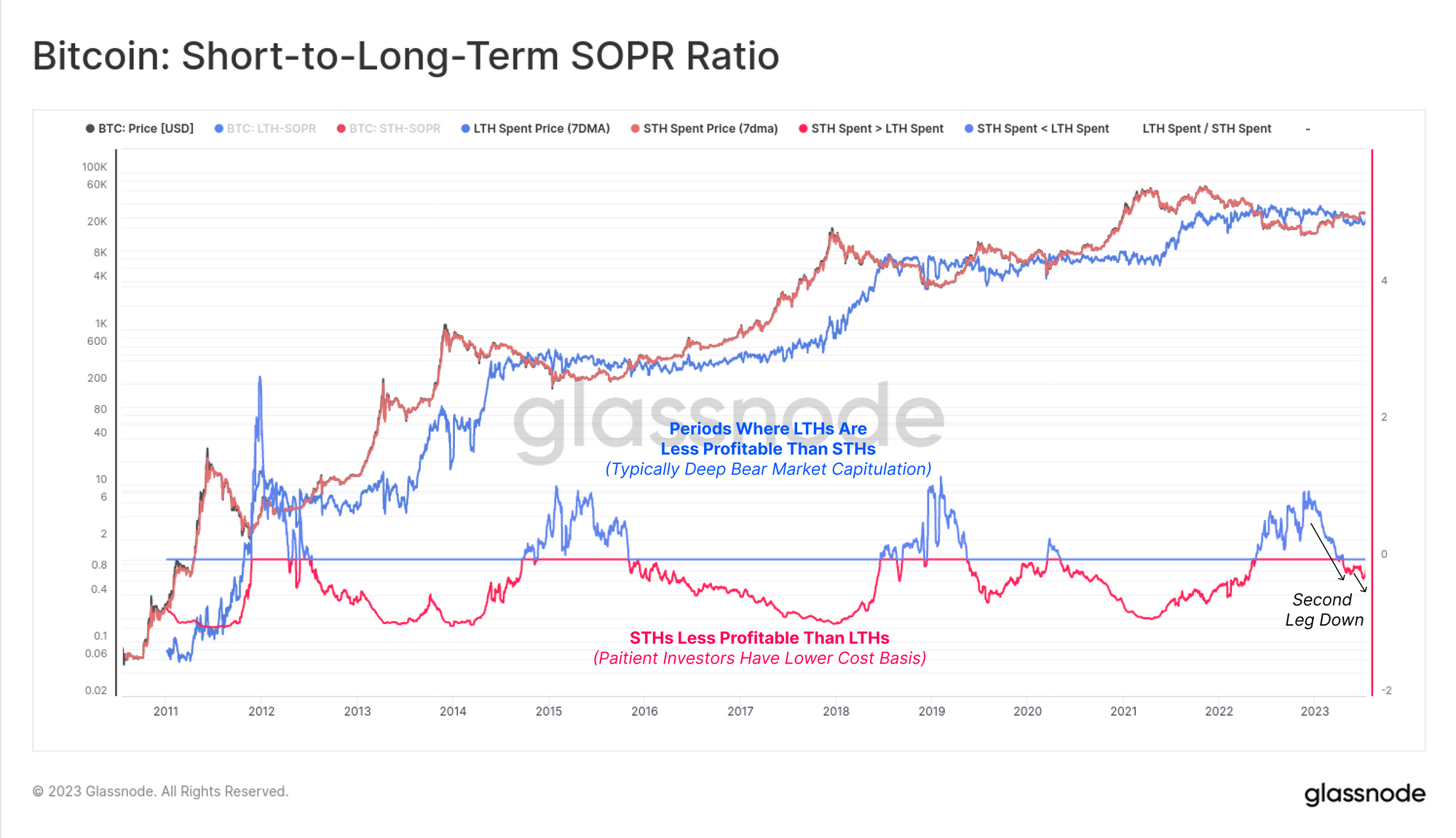
To close this edition, we will call back to our report from just over a year ago titled The Darkest Phase of the Bear (WoC 24-2022, June 2022). In this report, we introduced a metric which helps identify large scale shifts in LTH and STH behavior.
It is uncommon for the LTH cohort to spend coins that have a higher average cost basis (lower profit multiple) than the STH cohort. However, such events do occur, and are historically associated with deep bear market capitulation events. These are periods where even the strongest hands are purged from the market, in particular those that acquired coins near the cycle top and then weathered the full duration of the downtrend.
With the strong price performance YTD, and the dominance of STH spending this week, this SOPR ratio has commenced its second leg down. This provides a macro scale view on a reversal in investor behavior. There has only been one instance in March 2020 where an ‘echo bounce’ occurred in this metric, pushing back above 1.0 before spending a multi-year period below it.
Summary and Conclusions
Despite setting a temporarily new yearly high of $31.7k this week, BTC prices continue to trade within a very tight trading range. This has resulted in an extreme tightening of the Bollinger Bands, separated by just 4.2%. This compression in volatility is matched by cyclical lows in realized profit and loss being locked in by the market.
The Short-Term Holder cohort dominates the inflows into exchanges at present, incentivised by over 88% of supply now being in profit. However on the broader scale, investors appear remarkably unwilling to let go of their supply. In many ways, this resembles periods like 2016 and 2019-20, characterised by choppy market conditions.

- SEO Powered Content & PR Distribution. Get Amplified Today.
- PlatoData.Network Vertical Generative Ai. Empower Yourself. Access Here.
- PlatoAiStream. Web3 Intelligence. Knowledge Amplified. Access Here.
- PlatoESG. Automotive / EVs, Carbon, CleanTech, Energy, Environment, Solar, Waste Management. Access Here.
- BlockOffsets. Modernizing Environmental Offset Ownership. Access Here.
- Source: https://insights.glassnode.com/the-week-onchain-week-29-2023/